Balancing speed with safety
Railway passengers want to reach their destinations as fast as good engineering and safe practices permit. Therefore, train conductors must sensibly operate locomotives by being alert to railway signals, increasing or decreasing speed as track conditions change. While conceptually straightforward, the task can prove difficult, especially as rolling miles of running tracks may lull the conductor to sleep. In this situation, a conductor might understandably be tempted to accelerate in order to reach the destination as quickly as possible. Unfortunately, the impulse could put the train at risk of becoming derailed by unseen twists and turns that lie ahead in the journey.
This scenario is emblematic of professional investors striving to help clients achieve their financial goals. To do so, it means generating attractive investment returns with as much predictability as possible. When balancing speed with safety, investors must fend off complacency during the late stages of extended bull markets. It’s precisely at these times that professional investors should remain disciplined, alert to any signs of deteriorating economic conditions.
Today, we fear that many investors don’t see, and may never see, signals1 indicating that a sharp and potentially swift bend may be closer than it appears. As a result, they risk becoming derailed. For example, we have discussed the elevated levels of valuations and therefore lower levels of expected returns across equities, especially in the U.S. And, we have also identified several factors contributing to our view, including those related to monetary policy, fiscal policy and behavioral investing (e.g., overconfidence).
Negative earners
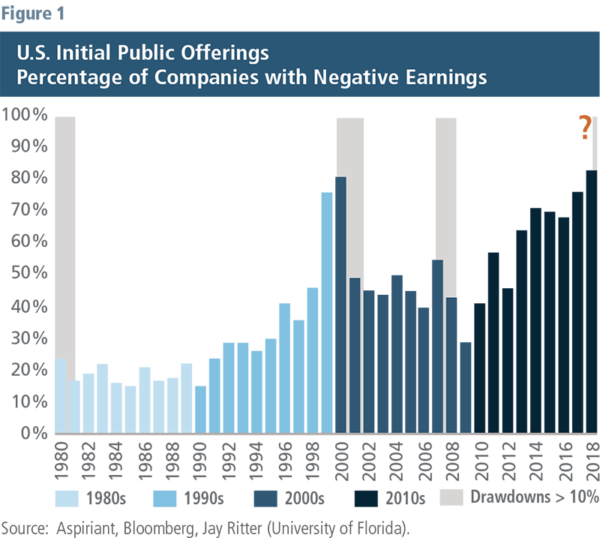
Figure 1 presents yet another signal that the investment environment may be headed for a downturn. It shows the percentage of companies with negative earnings filing for initial public offerings (IPOs) overlaid with the periods in which the S&P 500 experienced a drawdown of 10% or more during a period of at least three months. We have color-coded each decade to highlight that the drawdowns generally coincided with the secular peaks for these IPOs. Analyzing the data in this manner also acknowledges changes in both underwriting and accounting standards over time.

Although the chart isolates drawdowns of at least 10%, it’s important to note that the actual maximum drawdowns were significantly more severe: 27% in the early-1980s, 49% in the late-1990s and 57% in the mid-2000s. It’s equally important to note that the drawdown periods didn’t last forever. On average, they began and ended within about 18 months, fully recovering the value lost during each period. Finally, each of the drawdowns offered savvy investors buying opportunities to earn extraordinary returns along the way. But, they had to have the analytical framework and emotional fortitude to become aggressive when others had succumbed to fear.
So, why have the peaks for these IPOs coincided with meaningful drawdown periods? Some might conclude the occurrence exemplifies the strength and depth of the capital markets’ abilities to look through recent results and evaluate new business models and technologies. On the contrary, we take it as a sign that bad deals are likely getting done. In fact, we believe the answer relates to these companies and their underwriters attempting to push through as many deals as possible before capital markets no longer support questionable offerings. Doing so often means persuading investors that the company’s poor performance will improve, even when that result is unlikely.
Additional insights
1. Slower flow — We believe the free flow of capital across markets, including IPOs, is necessary for a well-functioning financial system. Therefore, closing or otherwise restricting access is generally a bad thing. However, given the inferences we’ve made above, perhaps one good aspect of the partial government shutdown is the Securities and Exchange Commission has stopped reviewing and approving corporate registration statements, including proposed IPO filings. So, perhaps the shutdown has at least slowed the spigot on these risky offerings.
2. Danger signs — Three recent IPOs2 illustrate the dangers of investing in companies with negative earnings. Blue Apron (APRN) has dropped approximately 90% since going public, making it the third worst IPO over the past decade. Similarly, Snapchat (SNAP) is down 75%, while ADT Security (ADT) has sold off 51%.
3. The return of active management — Investing in market capitalization-weighted funds has outperformed actively managed funds over the past decade. However, we believe skilled managers will outperform unskilled managers over the next several years. This analysis supports our view. Market cap-weighted portfolios are required to invest in all publicly traded securities held by their reference index, including bad IPOs. To the contrary, active managers can use their good sense to avoid companies they believe are likely to underperform.
Disappointing earners
We’re not just worried about companies generating negative earnings. We’re also concerned that publicly traded companies, taken as a whole, will likely underperform the lofty expectations analysts have set for them over the next few years. Naturally, our views aren’t uniform across every single company. The areas creating the most apprehension include growth, overvalued and low-rated stocks. However, we also see pockets of (relative) opportunity, including value, quality and low-volatility stocks. Again, it’s worth noting that market cap-weighted portfolios own all publicly traded companies while active investors tilt their portfolios according to their outlook.
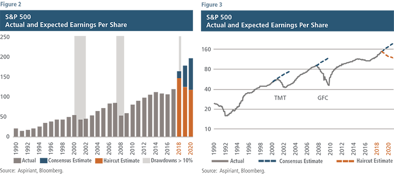
Figure 2 shows the actual and expected consolidated earnings per share of the 500 companies in the S&P 500 index.3 The “consensus estimate” represents the combined average of dozens of equity analysts’ earnings expectations for the underlying companies. The stacked bars in 2018,4 2019 and 2020 show the actual analysts’ consensus estimate as well as a “haircut estimate” we’ve applied to roughly reflect more realistic performance should the economy decelerate. We are not attempting to be too precise with this analysis, we are simply trying to provide a “ballpark estimate” of what might be more likely to occur in the future based on what’s actually occurred in the past.

Assuming our haircut estimates are more reasonable than the consensus estimates, the aggregate earnings shortfall for the 500 companies could approach $600 billion in 2020.5 Needless to say, that would be a significant miss. Importantly, analyst expectations can, and often do, differ from market expectations. We suspect that some, but not all, of the potential shortfall is already baked into prevailing equity market valuations. So, the outcome wouldn’t necessarily cause a devastating washout, but it most certainly doesn’t indicate advancing markets either.
Figure 3 displays the information as a line chart, adding the consensus estimates immediately preceding the Technology, Media and Telecommunications (TMT) event as well as the Global Financial Crisis (GFC). The chart helps convey two things: once actual earnings began to slide, the rollover happened rapidly; and the magnitude of the shortfall between actual and expected earnings worsened as time passed.
This occurs because one company’s spending is another company’s revenue. So, when one company cuts spending (e.g. because it missed its earnings expectations), another company makes less money, reducing its earnings and causing that company to cut its own spending. This downward spiral generally continues until such time that sufficient financial support (e.g. monetary stimulus, fiscal spending, etc.) becomes available. Once stabilized, the economy begins to recover and the process reverses.
Early sign: As we were going to press with this Insight, several large companies missed their earnings expectations, reduced forward guidance and/or announced employee layoffs. The companies include Tesla, Morgan Stanley, FedEx, Apple, Samsung, Constellation Brands, Citigroup and JPMorgan. We believe these announcements are just the beginning of a long parade of disappointing corporate earnings announcements over the coming quarters.
Okay, so what if we’re right? Won’t the American consumer or the U.S. Federal Reserve step in to limit the damage? Unfortunately, this time around, we don’t believe either is well-positioned to do so.
The American consumer
Over the past decade, each of us has benefited — to one degree or another — by the unprecedented amount of liquidity injected into the financial system.6 As robust as the economy has been since the GFC, we probably should have been increasing our savings, anticipating that another downturn would eventually become imminent. Instead, in aggregate, we have borrowed (creating credit) and we have spent (purchasing power).
Since one person’s spending is another person’s income, millions of jobs have been created. These jobs have meant more income, which has led to ever more spending. No doubt, our collective spending helped the economy recover, grow and strengthen. However, not all credit creation is good credit creation. Indeed, bad credit creation (meaning it likely won’t be repaid) can magnify consumer vulnerability during a downturn.
The following survey results7 underscore the financial fragility across the country. Accordingly, the legendary American consumer may not be well-positioned to help stimulate growth during the next downturn.
Household income
- 78% of adults self-identify as living paycheck to paycheck
- 40% of households earn less than $40,000 per year, 25% earn less than $25,000
Savings and retirement
- 40% of adults cannot cover a $400 emergency with their cash savings
- 60% of adults consider themselves behind schedule on saving for retirement
- 50% of households have less than $12,000 saved, 30% have less than $1,000, and 25% have no savings/pension
Debt
- Total household debt recently set an all-time record at $13.5 trillion
- 2.8 million people over the age of 60 are still paying off their student debt
- Only 23% of people carried “no debt” in 2018, down from 27% in 2017
Liquidity linkage: Consumers and companies
Central banks, like the U.S. Federal Reserve Board, use monetary policy to influence liquidity in the financial system by decreasing or increasing interest rates. For example, the Fed took dramatic steps to lower interest rates in the GFC, guiding them higher in recent years.
Lower interest rates lead to increased borrowing related to homes, cars and vacations, as well as other goods and services. This “credit creation” allows consumers to spend more than they otherwise would. Increased consumer spending leads to higher revenue to the companies producing the goods or providing the services. The higher revenue, in turn, enables companies to pay more employees higher wages and salaries. These employees are also consumers, who then begin to spend more themselves.
So, lower interest rates lead to credit creation and higher consumer spending, which leads to higher corporate revenue, earnings and valuations. Conversely, higher interest rates lead to credit contraction and lower consumer spending, which leads to lower corporate revenue, earnings and valuations.
Fed to the rescue?
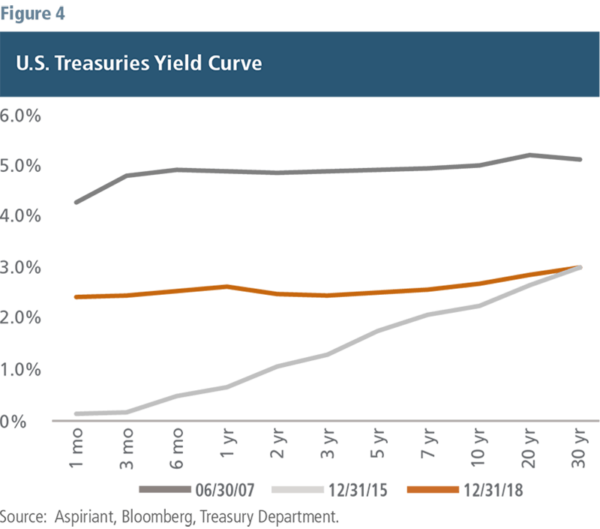
As discussed, central banks can encourage or discourage economic growth by changing the prevailing level of interest rates. For example, the Fed increases or decreases the federal funds rate to shift short-term interest rates and buys or sells financial assets to influence long-term interest rates.
Figure 4 illustrates the yield curve for U.S. Treasuries.8 In June 2007, both short-term and long-term rates were reasonably high, giving the Fed ample ability to reduce rates. And, that’s precisely what they did, with rates eventually bottoming out around December 2015. This massive rate reduction spurred both consumer and business spending, stabilized the economy and encouraged growth. However, today interest rates are at roughly half of the prevailing levels in June 2007. Therefore, reducing rates will likely have significantly less impact during the next downturn.
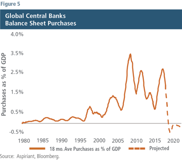
Figure 5 displays the actual purchases and expected sales of financial assets by the governments of the five largest global economies, the so-called G5 economies.9 By purchasing financial assets, a government essentially becomes another market participant. Therefore, government-related asset purchases (or sales) lead to higher (or lower) prices, and consequently lower (or higher) yields. As a group, the G5 countries have been net purchasers of financial assets, which encouraged economic growth and buoyed asset prices over the past 20 years. However, they are now expected to become net sellers, which would likely discourage economic growth and depress asset prices going forward. Of course, they can always reverse course and become buyers again. However, given the widening income inequality gap, strategies that disproportionately benefit the wealthy (owners of financial assets) may further stoke the ire of voters, pressuring politicians to dissuade such measures.
Understanding the tradeoffs
Our flexible approach to asset allocation allows us to actively manage client portfolios differently than passively managed portfolios. We intentionally position our portfolios to generate the most favorable risk-adjusted returns over a complete market cycle. By contrast, passively managed portfolios must proportionately own every equity and bond security included in their market-weighted benchmarks, without regard to expected risk or return.
Since we cannot time the market, being different than our benchmarks necessarily means making a tradeoff: We are willing to underperform during overextended markets in exchange for the opportunity to outperform during market pullbacks. Understandably, prolonged bull markets can test patience, leading to questions like, “What if you’re wrong?” Conversely, swift bear markets tend to shore-up confidence, leading to compliments like, “Thank you for being prepared.”
The fourth quarter serves as a prime example of the latter. The selloff took a toll on most financial assets, with equities losing approximately 13%, depending on the reference index. A passively managed, globally balanced portfolio was down 7.0%. By comparison, our All Weather portfolio was down just 3.8%, protecting a considerable portion of client assets.
We cannot know the timing, depth or length of any downturn. However, history indicates that we may be in the early stages of a spiraling process that will play out over the next several quarters. Therefore, we continue to be defensively positioned, tilting toward assets we believe will perform relatively well in a low-growth, low-inflationary environment. In so doing, we expect to safely grow our client assets until such time that the signals and track conditions indicate “increase speed.”
Footnotes:
1See our Insights published in Q4 2017 through Q3 2018.
2APRN went public in June 2017, SNAP in March 2017 and ADT in January 2018. Each of the drawdowns is calculated from the date of the IPO through 12/31/2018.
3As discussed in our Q3 2018 Insight, the large change from 2017 to 2018, 2019 and 2020 reflects the one-time step up in earnings expectations related to the Tax Cuts and Jobs Act passed in December 2017.
4Many companies report earnings-per-share in the months following a calendar year-end. So, the most recent year, 2018, doesn’t become actual until the middle of 2019.
5Based on a shortfall of $77 per share, with total earnings of $1.2 trillion and market capitalization of $21.8 trillion as of 12/31/18.
6For a broader discussion, see our Insights published in Q1 2018 and Q3 2018.
7Sources: Career Builder Survey, United Way, MagnifyMoney, Economic Well-Being of U.S. Households, U.S. Federal Reserve Board, Northwestern Mutual’s 2018 Planning & Progress Study. Other surveys referenced include those conducted by SmartAsset and GOBankingRates, each of which reached findings.
8Although we haven’t presented the yield curves for the other G5 economies, suffice it to say they don’t appear to be better positioned than in the U.S.
9The G5 economies include, the U.S., China, Eurozone, Japan and the U.K.
Illustration by Ken Cummings
Important disclosures
Past performance is no guarantee of future performance. All investments can lose value. Indices are unmanaged and you cannot invest directly in an index. The volatility of any index may be materially different than that of a model. The charts and illustrations shown are for information purposes only.
Equities. The S&P 500 is a market-capitalization weighted index that includes the 500 most widely held companies chosen with respect to market size, liquidity and industry.

 Talk to us


