Uncle Warren’s favorite charts
Warren Buffett has said the comparison of equity market capitalization (market cap)1 to gross domestic product (GDP) “is probably the best single measure of where valuations stand at any given moment.”2 Intuitively, GDP can be thought of as charting the long-term flight path of equities. That’s because total market capitalization consists of more than a thousand publicly traded companies, which in turn represent a broad swath of the overall economy.
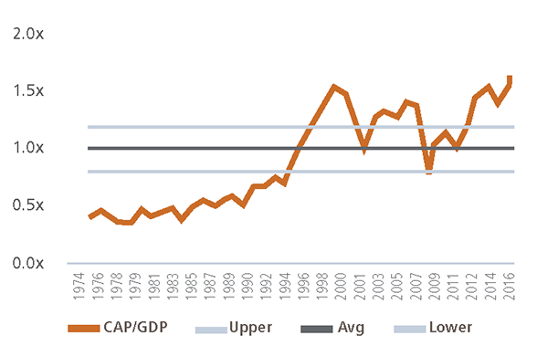
The first chart below shows the total market capitalization of U.S. equities compared to U.S. GDP. Significant differences between the lines indicate more attractive or less attractive environments for equities. For example, when market cap is below GDP, like the years leading up to the early 1990s, as well as ever so briefly during the trough of the credit bubble, equity prices were more likely to “ascend” from the “lift” created by economic growth. And, they did. Conversely, when market cap is substantially above GDP, like the peaks of the tech and credit bubbles, equity prices are more likely to “descend” from the “pull” back toward long-term economic growth. And, they did.
The second chart illustrates the ratio between the two lines (market cap divided by GDP). We believe that a ratio of 1.0x (meaning, market cap equals GDP) is a reasonable long-term assumption. However, as with any multi-year analysis, we assume some “flexibility” around the long-term average to account for changing environments. For example, over the past 20 years, globalization of businesses, lower interest rates, better accounting standards, improved earnings guidance and accommodative monetary policy have all provided support to prevailing equity valuations.3 We adjust for these changing economic environments or “paradigm drifts” by assuming the ratio varies by plus or minus 20%. In dollar terms, that means overall equity market capitalization could range from approximately $16 trillion to $24 trillion (since GDP is expected to approach $20 trillion in 2017). Within that range, we would consider U.S. equities neither cheap nor expensive and would maintain our long-term strategic exposure. Unfortunately, there was no fundamentally justifiable reason (see Primer below) for the ratio to exceed the top end of the range during the tech bubble nor the credit bubble. Eventually, equities cratered. More concerning, we cannot think of enough valid reasons to support the ratio’s current level, which is at an all-time high of 1.6x. As a result, we have begun questioning whether or not we should consider the current environment a “Fed bubble.”
U.S. Equity Market Capitalization vs Gross Domestic Product
Ratio Analysis
Market Capitalization to GDP
Sources: World Federation of Exchanges, Bloomberg and Aspiriant.
Successful investing requires good sense
An investor in a privately held company understands her return on investment (ROI) with clarity and precision. It is measured by total cash distributions (e.g. dividends) she receives as the owner of the business divided by the amount she invested in (or paid for) the business. And, what if she owned 500 private companies? Same answer. Her ROI would be the total distributions divided by the price she paid. To properly set her expectations and plan accordingly, our savvy private company investor might like to forecast the future distributions she expects to receive from the businesses. If she owned just one business in one industry, she would likely experience pronounced ebbs and flows of the business cycle as both the company and its industry would be susceptible to faster or slower growth, and therefore more or less profitability. In some years, cash flow would be plentiful, while in others it would be lean.
However, if she owned a portion of 500 companies across 11 different sectors, her cash flows would be substantially more stable and therefore predictable. As one business or sector was shrinking another might very well be expanding. She would never enjoy a feast, but she would never suffer a famine. And, since those 500 companies would represent a large portion of the overall economy, rather than attempting to forecast each individual company’s future dividends, she could simply substitute the overall growth rate of the economy to forecast her future dividends. So, basic math (addition and division) would allow our investor to know everything she needs to know about her current and expected ROI. It’s really that simple.
So, why do investors so often lose their good sense when it comes to investing in publicly traded companies? For emphasis, it is clear to us that many investors today appear willing (whether wittingly or unwittingly) to purchase stocks regardless of the price and consequently accept lower future returns on their investment.
Aspiriant’s CMEs: Investing with a margin of safety
The challenge with accepting lower future returns is that doing so reduces, or eliminates, any potential margin of safety,4 which helps protect a portfolio during market pullbacks. Our portfolio construction process is intentionally designed to curtail negative investment returns (drawdown risk) during periods of market dislocation. We deliberately position portfolios in this manner because we believe the best way to generate attractive long-term returns is to first avoid significant declines. We are not alone. The table below helps illustrate why protecting portfolios on the downside is so incredibly important. It shows the actual drawdown caused by the Global Financial Crisis on two globally diversified portfolios along with the required return to recover back to the initial portfolio value. The first row indicates that a passive (i.e. market capitalization weighted) portfolio consisting of 60% in global equities and 40% in municipal bonds experienced a drawdown of 36%.5 Clearly, a significant allocation to municipal bonds did not sufficiently diminish the overall severity on passively managed portfolios. Moreover, the required rate of return to replenish the portfolio was a lofty 55%.
Impact of the Global Financial Crisis |
|||||
| Initial Portfolio | Actual Drawdown | Required Recovery | Ending Portfolio | ||
|---|---|---|---|---|---|
| Passive 60/40 Benchmark | $1,000,000 | -36% | 55% | $1,000,000 | |
| Select Fund Managers | $1,000,000 | -17% | 21% | $1,000,000 | |
The second row is an evenly split composite of two funds,6 each of which is included in a broader comparables composite7 against which we compare and contrast our portfolio performance. We selected those two funds because their Capital Market Expectations (CMEs) most closely mirror our framework8 in terms of valuation sensitivity, the magnitude of the forecasts and the rank order of the forecasts. As shown, these managers experienced a drawdown of just 17%, less than half the drawdown experienced by passive investors. Importantly, that lesser drawdown resulted in a much lower required return of 21% to replenish the portfolio.
Aspiriant’s EKGs: Limiting things we have missed
We first published our CMEs back in 2004 and have improved and refined our process over the years. We are confident that portfolio allocation decisions stemming from our current framework will serve clients well for many years to come. That said, we continually challenge our decisions and corresponding results to help ensure that we’re properly analyzing both risks and opportunities. We constantly ask ourselves questions like, “What has changed?,” “Is it important?,” “What, if anything, should we do about it?” and “What if we’re wrong?”
To help us formulate answers to these questions, we have developed an extensive library of data to more fully analyze equities, bonds, currencies and commodities as well as economic data related to growth, employment, demographics, interest rates and inflation. The library allows us to monitor changes in relevant data we believe affects future investment returns. It is so extensive that we often say we have developed “EKGs on the entire financial system.” That may be overstating the scope, but the phrase helps convey the breadth of the analysis. We use the term EKG because much of the analysis is displayed as real-time line charts, which resemble electrocardiograms. For example, the charts above are just two of the hundreds of EKGs we monitor.
The combination of our CMEs and EKGs are intended to fortify good sense (an understanding of fair value) with good perspective (an understanding of valuation and mispricings).
Primer: Factors affecting economic growth
Long-term, sustainable economic growth (and therefore the fair value of equities) is heavily influenced by two primary sources of “fuel.”9 First is the change in the size of the labor force. Growth in the workforce provides the people to produce additional goods and services. This can be measured by the change in the Labor Force Participation Rate,10 which measures the percentage of the working age population who are working or want to work. The second is the overall productivity of the labor force, which is represented by the output produced (i.e. GDP) for every hour worked during the period. Technological advances, among other factors, can help increase workforce productivity.
The problem in the U.S., like most developed economies, is that neither the size nor the productivity of the labor force seems to be increasing. At a minimum, we’re not expecting dramatic improvements in demographics, which are necessary to reverse the prevailing trends and overall slowdown in GDP.
Short-term, unsustainable economic growth (which often leads to unrealistic expectations and extended valuations) can be temporarily influenced by changes in monetary policy (interest rates and treasury purchases/sales) as well as changes in fiscal policy (taxing and spending). In the U.S., monetary policy is set by the Federal Reserve while fiscal policy is set by the president and Congress. In practice, policy changes have tended to pull forward future economic activity (expansionary) or defer economic activity (contractionary), but have not generally created sustained improvements. The result emanates from policies that are all too often ineffective, modified or reversed in subsequent years. As such, policy changes can act like short bursts of fuel, but do little to alter the long-term trajectory of economic growth.
Remaining fully, but sensibly invested
Market timing is fraught with failure, and we don’t know anyone who has demonstrated repeatable skill in this regard. So, rather than attempt to do so, we use our CMEs to form comparisons related to the relative attractiveness, or unattractiveness, of each asset class we follow. These comparisons help us assess the tailwinds or headwinds we expect each asset class to face over the ensuing market cycle. This exercise helps us rank asset classes and set portfolio allocations. The overall objective of the process is to maximize the amount of investment return we expect a portfolio to generate relative to the amount of risk in the portfolio. This is precisely what we mean when we say, “We position portfolios to only take on risk for which we expect clients to be reasonably well compensated.”
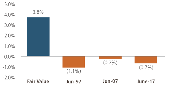
The chart below helps illustrate the point. It compares (or ranks) two asset classes: the S&P 500 Index and Barclays Municipal Bonds Index. At fair value (or when both equities and bonds are fairly priced), the blue bar shows our expectation for equities to outperform bonds by approximately 3.8% annualized over the ensuing seven years.
Relative Capital Market Expectations
S&P 500 Forecast Minus Muni Bonds Forecast
Unfortunately, markets aren’t always efficient, and mispricings often occur (and much more frequently than one might statistically expect). Indeed, the orange bars illustrate three points in time to which we have applied our current CME framework.11 The retroactive comparisons indicate that bonds would outperform equities over the ensuing seven years. That result is primarily due to the elevated and unsustainable level of equity valuations entering each of the three periods. For example, in June 1997, our CMEs expected bonds to outperform equities by 1.1%, annualized over seven years. We would have formed similar expectations in June 2007 and have, in fact, formed similar expectations as of June 2017. Acting on this analysis, we have been reducing our exposure to equities while maintaining or increasing our exposure to both bonds and defensive strategies.12
As a reminder, our CMEs are seven-year, average annualized forecasts. They are neither designed nor intended to predict each year’s actual returns. Indeed, when market prices exceed fair value for an extended period of time, we expect to underperform our passive global balanced benchmarks, at least for a while. For example, between the summers of 1997 and 1999, U.S. equities continued to rally and we would have looked like goats for reducing them. However, by 2000 the tide quickly turned, with U.S. equities losing approximately $4 trillion dollars in market capitalization over the 24-month period between December 2000 and December 2002. Clearly, favoring bonds over equities in 1997 and 2007 served investors extremely well. And, we believe the same result will prevail over the next seven years; although shorter periods will likely vary.
Finding opportunities outside of U.S. equities
To be fair, U.S. equities have handsomely contributed to portfolio performance over the past eight years. Unfortunately, neither our CMEs nor our EKGs suggest that they’ll continue to do so going forward. Fortunately, our current underweight to U.S. equities provides a “budget” to overweight other, better-positioned asset classes. Currently, our forecasts indicate that international equities, emerging equities and defensive strategies will all positively contribute to performance over the next seven years, like they have in many other environments. In order to take advantage of this opportunity, we have positioned our portfolios accordingly.
As always, we will continue to actively monitor the investment environment and will communicate any changes in our outlook and portfolio positioning as they occur. In the meantime, please feel free to reach out to your investment advisor for further discussion.
Footnotes:
1Total equity market capitalization is defined as the sum of the equity value (share price multiplied by shares of common stock outstanding) for all publicly traded companies.
2Source: Fortune Magazine interview with Warren Buffett in 2001.
3We plan to expand on this discussion in an upcoming Foundational Elements.
4Margin of safety is a key investing principle and companion to diversification. Both help to reduce the odds of a severe loss and the consequences of an investment decision being wrong. For more on this concept, see “Margin of Safety: Risk-averse Value Investing Strategies for the Thoughtful Investor,” by Seth Klarman of the asset management firm, Baupost Group in 1991.
5Drawdown assessed during the period from 10/1/2007 through 3/1/2009.
6GMO’s Benchmark-Free Allocation Fund and PIMCO’s All Asset All Authority Fund.
7Our complete comparables composite consists of four additional funds from BlackRock, DFA, Goldman Sachs and JPMorgan. The composite excludes U.S. only balanced portfolios.
8For a broader discussion, please see our CME Insight from March 31, 2016.
9For purposes of this discussion, we have omitted investments in infrastructure, which can also contribute to long-term, sustainable economic growth.
10The Labor Force Participation Rate is the proportion of people participating in the labor force (those who work or want to work) divided by the total population. It excludes children, retirees and those not actively seeking work (e.g. homemakers, students, prisoners, etc.).
11Since 2004, our CME framework has undergone numerous improvements. For example, our current CME framework explicitly incorporates prevailing valuation levels. The current framework did not exist in 1997 or 2007, but we have applied it historically for comparison purposes.
12For a broader discussion on defensive strategies, please see our Q1 2017 Quarterly Letter.
Important disclosures:
The information in this article is created by Aspiriant and should not be considered investment advice or a recommendation to adopt any investment strategy. The opinions expressed are as of July 31, 2017, and are subject to change. Consult your personal investment advisor before buying or selling any securities.
Past performance is no guarantee of future performance. All investments can lose value. Indices are unmanaged and it is impossible to invest directly in an index. The volatility of any index may be materially different than that of a model.
Equities. The S&P 500 is a market-capitalization weighted index that includes the 500 most widely held companies chosen with respect to market size, liquidity and industry. The Russell 2000 Index measures the performance of the small-cap segment of the U.S. equity universe. It is a subset of the Russell 3000 Index representing approximately 10% of the total market capitalization of that index. It includes approximately 2000 of the smallest securities based on a combination of their market cap and current index membership. The MSCI EAFE Index (Europe, Australasia, and Far East) is a free float-adjusted market capitalization index that is designed to measure the equity market performance of developed markets, excluding the U.S. and Canada. The MSCI Emerging Markets Index is a free float-adjusted market capitalization index that is designed to measure equity market performance of emerging markets. The MSCI ACWI Index is a free float-adjusted market capitalization weighted index that is designed to measure the equity market performance of developed and emerging markets.
Fixed Income.The Barclays U.S. Aggregate Index represents securities that are SEC-registered, taxable and dollar denominated. The index covers the U.S. investment grade fixed rate bond market, with index components for government and corporate securities, mortgage pass-through securities and asset-backed securities. These major sectors are subdivided into more specific indices that are calculated and reported on a regular basis. The Barclays Municipal Bond Index is a rules-based, market-value-weighted index engineered for the long-term tax-exempt bond market. The index has four main sectors: general obligation bonds, revenue bonds, insured bonds and pre-refunded bonds. The Barclays High Yield Municipal Bond Index is an unmanaged index composed of municipal bonds rated below BBB/Baa.
Real Assets. The S&P GSCI® is a composite index of commodity sector returns representing an unleveraged, long-only investment in commodity futures that is broadly diversified across the spectrum of commodities. The returns are calculated on a fully collateralized basis with full reinvestment. Wilshire Global RESI is a broad measure of the performance of publicly traded global real estate securities, such as Real Estate Investment Trusts (REITs) and Real Estate Operating Companies (REOCs). The index is capitalization-weighted. The Alerian MLP Index is a gauge of large and mid-cap energy Master Limited Partnerships (MLPs). The float-adjusted, capitalization-weighted index includes 50 prominent companies and captures approximately 75% of the available market capitalization.

 Talk to us


