IS&R Highlights
- Investing through 2022 has felt like driving through a downpour or deluge.
- Household net worth is getting hit hard, but is still near an all-time high at $136 trillion or approximately 5.4 times the level of Gross Domestic Product (GDP).
- Wealth levels achieved all-time highs due to the tailwinds of low inflation, declining interest rates and household transfer payments.
- Meanwhile, the U.S. economy appears headed towards a recession as wages struggle to keep up with inflation and historic sources of credit support like home equity and credit cards become increasingly difficult or expensive to access.
- However, we are starting to see beams of sunlight break through the clouds with cash, bonds, and some equities appearing to offer reasonable expected returns.
- We believe a risk-managed, valuation-sensitive approach to portfolio construction across geographies and asset classes is especially important today given our expectations for continued volatility and elevated uncertainty.
Driving Through a Deluge
When driving, it can be unnerving to encounter a heavy downpour. Driving quickly through the deluge can lead to an accident, while driving too slowly or stopping extends the time and stress to clearer skies. Skilled investing, like good driving, means proceeding along one’s journey at a reasonable and safe pace, using sound decision making.
Investing throughout 2022 has felt like driving through a downpour or deluge especially for those who lost 80% to 90% in some of the riskiest investments, including meme stocks, cryptocurrencies, IPOs of companies with negative earnings, and Special Purpose Acquisition Companies (or SPACs).
More broadly, U.S. Household Net Worth is experiencing a decline, though it’s still near an all-time high at $136 trillion which is approximately 5.4 times the level of Gross Domestic Product (GDP). Two-thirds of our combined net worth is comprised of equities at $49 trillion and real estate at $41 trillion. According to Federal Reserve data, about $6 trillion has been lost through the first half of 2022, but that estimate understates actual losses due to lagging valuations associated with private equity, venture capital and private real estate, among other factors and continued asset declines in the third quarter. Moreover, conditions could certainly get worse before they get better.
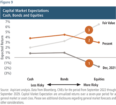
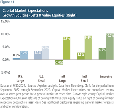
But we’re starting to see some beams of sunlight appear through the clouds. At this point, cash, bonds, and some equities appear to offer reasonable expected returns. Within fixed income, municipal bonds are priced to generate above-average rates of return. In addition, TIPs (or Treasury Inflation Protected Securities), high yield and emerging market debt are beginning to offer expected returns closer to their historic norms. Within equities, value stocks are well-positioned globally, offering both long-only and long/short opportunities. Within value equities, Europe, Japan, and Emerging Markets look attractive while growth stocks could continue to struggle, especially if (i) inflation and/or interest rates surprise to the upside, or (ii) economic growth, corporate profitability and/or geopolitical tensions worsen.
Know What to Expect
In order to conceptualize how the economy interrelates to financial markets during a rate-hiking cycle, we think a rainstorm is a helpful guide: first the clouds come, then the rain, next the lightning and then the thunder. In order to know what to expect going forward, we studied, and put into context, historical financial storms triggered by rate-hiking cycles. Financial storms follow a natural progression that we are sharing with you because knowing what to expect – and how it all links together – is precisely what allows investors to make it through financial storms safely:
- Clouds/Market Peak: Financial storms start at a peak formed after many years of accumulating clouds caused by risk-taking (by that we mean both carefree spending and speculative investments).
- Rainfall/Pause: While the rain is pounding, the Fed tends to pause (stops hiking rates), but not until after the Federal Funds Rate (FFR) exceeds consumer price inflation (Core CPI).
- Lightning/Pivots: Thereafter, the Fed pivots (by reducing rates) before an economic recession occurs. That’s the lightning: because recessions exhibit slowing growth, rising unemployment, falling income, decreasing profitability, and deeper equity selloffs.
- Thunder/Market Trough: Eventually, financial storms experience a market trough or the thunder caused by the lightning of recession. But market troughs typically occur months after recessions begin.
It’s important to have a sense as to the severity and duration of any storm. Although more qualitative – because the assessment requires exercising some judgment – analyzing fiscal and monetary policy shifts helps us consider externalities that may affect economic and market outcomes. So, as you’ve seen from previous publications, we’ve worked hard to understand the Fed’s determination to drive inflation back down to its 2% target rate, which will likely lead to lost jobs and incomes, at least for some workers. Alternatively, the Fed could prove more willing to accept above-target inflation to preserve as many jobs, income, spending and growth as possible, but it likely comes at the cost of further eroding the broader population’s standard of living.
Wealth, Cash & Confidence
The market has come to expect the Fed, and possibly Congress, to bail its participants out at the first sign of trouble. As a result, we have come to enjoy steady increases in our overall wealth and cash – as well as our confidence. But we have to remind ourselves that the Fed and Congress were able to provide that overall sense of comfort because prevailing inflation was low, supporting declining interest rates and on-demand transfers whenever needed.
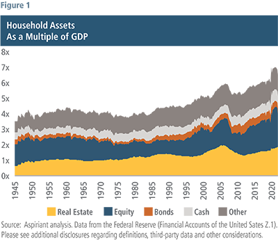 Figure 1 plots total Household Assets as a Multiple of GDP to scale it to the size of the overall economy. Since the 1990s, you can see the total value of our collective assets increased fairly steadily – save for the brief setback of the Global Financial Crisis from late-2007 through early-2009. Since the 1990s, inflation was generally range-bound between 1.5% to 3.5% per year made possible by three primary factors: increasing globalization (discussed in a recent Insight), innovation and automation.
Because inflation was low, the Fed was both willing and able to maintain low interest rates, creating a strong and steady tailwind to economic growth and asset prices. Moreover, it quickly reduced rates whenever trouble occurred along the way, for example in 2008, 2019 and 2020.
But, going forward, assets could struggle if:
- Inflation remains higher than expected, which could happen with slowing globalization as countries move to stabilize and secure their global supply chains.
- Or, if interest rates settle higher than target, which could happen if the Fed relaxes its dual mandate, possibly to stem rising unemployment in the future.
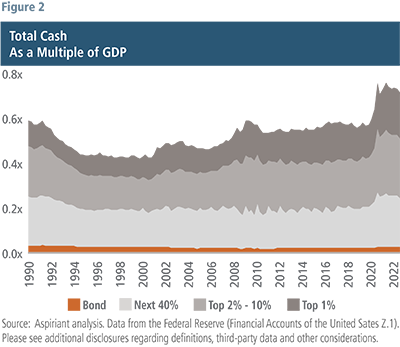 Figure 2 plots a more detailed view of the Cash, which is the light gray component on the Top Chart. Here, we break-out Cash by four different wealth cohorts. For example, the least wealthy 50% of us are represented by the orange sliver running along the bottom of the chart.
Every year, governments at all levels – federal, state, and local – transfer or redistribute income and wealth from some individuals to others. Total transfers approximated $3.1 trillion as of December 2019 on a seasonally adjusted, annualized basis. In March 2021, the total jumped to $8.2 trillion, largely related to Covid-19 stimulus programs. You can see that jump on the far-right hand side of Figure 1 for Household Assets as well as the far-right hand side of Figure 2 for Total Cash. The upshot is most of us have been flush with both assets and cash. But we believe the one-time windfall has largely passed through the system and transfers have reset back down to trendline at $3.9 trillion as of August of this year.
Moreover, we believe consumers are using a good portion of these cash balances to maintain spending on goods, services, and essentials. So, these outsized cash balances may not last much longer.
As we think about it, we don’t believe these charts reflect policymakers’ aspirations for recent fiscal stimulus programs. They weren’t trying to inflate the value of financial assets, specifically real estate, and equities, which are primarily owned by the higher income and wealth cohorts. And we certainly don’t think they intended to drive more cash, spending and speculation by those higher cohorts. Those were unintended consequences, or benefits depending on your perspective, of the massive flood of stimulus injected into the economy.
As a result, we are not surprised the Fed hasn’t prioritized the toll rapidly increasing interest rates has taken on owners of financial assets. Instead, Jay Powell and other members of the FOMC seem most determined to quell inflation, which disproportionately affects the most vulnerable among us. In fact, a recent study showed 63% of Americans currently self-identify as living paycheck-to-paycheck while the least 50% wealthy among us (the orange area in Figure 2) never had much cash reserves . . . even at the peak of the stimulus transfer programs.
Incomes Also Aren’t Keeping Pace with Spending
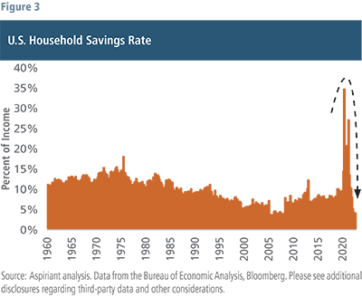
The same portion of the population living paycheck to paycheck are facing further pressures as incomes struggle to keep pace with either inflation or spending. As a result, households have rapidly reduced their savings rates as shown in Figure 3. In fact, the current savings rate has rolled over to the lowest level in 60 years. Like income, savings ballooned with Covid-related stimulus programs, reaching approximately $3.5 trillion in the 12 months ended March 2021. But rampant spending has eaten a large portion of incomes, reducing the ability of households to save, which is down to just 3.5% of disposable income.
Neither federal, state nor local governments are currently contributing, nor are they expected to contribute, outsized transfers to households. And, at this point, households themselves appear unwilling or unable to contribute to their own savings. So, eventually households are going to face one of three choices: decrease spending, increase debt or sell assets. And none of those lead to a good environment for equities.
Skyrocketing Mortgage and Financing Rates
In the past when consumers wanted to spend more than they were earning, many simply turned to the equity in their homes – refinancing at lower rates and splurging on goods and services funded from the cashed-out equity. However, this time around, skyrocketing mortgage rates are dissuading homeowners from tapping their equity and compelling them instead to turn to their credit cards at more than twice the cost.
 Figure 4 shows that home equity is simply no longer the honey hole it used to be. The orange line plots the prevailing mortgage rates on a 30-year fixed mortgage going back to the late-1990s. Just like treasury and other lending rates, mortgage rates declined persistently over the 25-year period. But that all changed when the Fed began raising rates earlier this year to subdue inflation. Across the board, lending rates increased, and for mortgages, that meant more than doubling – from 3% to roughly 7% in less than 12 months.
So, despite “tappable” home equity, which is the amount exceeding 20% of a home’s value, nearing an all-time high of $11.5 trillion, it’s just not as accessible as it once was due to the following factors:
- 90% of outstanding first-lien mortgages have rates of less than 5%. So, doing a cash-out refinancing into a 7% mortgage would be painful.
- Qualifying income levels increased dramatically for both existing homeowners seeking to refinance and for new home buyers. For first-time buyers, it has jumped from ~$48K in January 2021 to ~$84K a year-and-a-half later in August of this year.
- Affordability is near an all-time low with the average price-to-income multiple at ~7.8x. As points of reference, the GFC (Global Financial Crisis) peak was ~7.2x and the 75-year average was ~5.2x.
So, no surprise, weekly mortgage applications (for both purchases and refinancings) are down to ~220K, which is the lowest level since 1997. By comparison, the Covid peak was ~1.2M, or nearly 5 times the current level. Clearly, the Fed has gotten what it wanted from housing: the honey is staying in the hole.
What’s troubling to us, although it’s too early to draw any firm conclusions, is that consumers appear to be increasing the use of their credit cards to maintain spending.
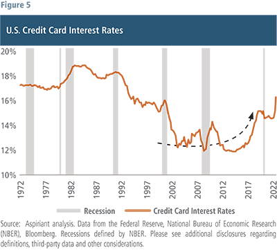
And, for an apples-to-apples comparison, if we look at outstanding credit balances to GDP over time, we find the percentage peaked around the GFC at ~6.9%, falling over the next several years to ~4.3% with abundant stimulus over those years. But recently, it has ticked back upward to 4.5%. And, that percentage could worsen with higher balances and weakening growth, jobs, and income. So, we are monitoring consumer credit usage closely.
Crisis of Confidence
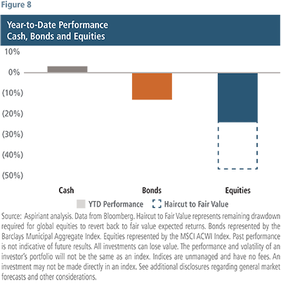
The most direct impact of higher interest rates has been on financial asset prices, with fixed income and global equity indices down roughly 12 to 25% year to date. The economic effects of higher interests are becoming more apparent but overall have been relatively minor so far. Since monetary policy works on a lagged basis, we expect the economic consequences of higher interest rates to become more pronounced over the next six to 12 months.
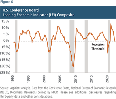
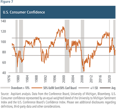
While not a component of the Conference Board’s Leading Economic Indicators Index, consumer confidence is thought of by many as another leading indicator, although it can change rapidly and be greatly influenced by recent events. Changes in wealth, employment and inflation are all drivers of consumer confidence. And confidence drives spending and spending drives economic activity. Figure 7 shows a blend of the University of Michigan Sentiment Index and the Conference Board’s Confidence Index. Drops in confidence usually lead or correspond with large drawdowns in equity markets and recessions, periods highlighted with the gray shading in the chart. And we are seeing a similar pattern today, with confidence dropping from an above average reading of 103 to a below average level of just above 70.
Selloffs Today Lead to Higher Returns Tomorrow
Plan Your Route and Proceed with Caution

Final Thoughts
The drawdown in financial assets this year is a function of primarily one variable, higher interest rates. Corporate profit expectations have remained virtually untouched. At the start of the year analyst estimates for the S&P 500 for this year and next were $220 and $242 per share, respectively. Today, they stand at $223 and $240 per share. Up 1.3% in one case, and down 0.7% in the other. This optimistic outlook comes at a time when economic fundamentals are, in fact, deteriorating. Really the outlier is the unemployment rate, which remains at a historic low of 3.5%. The wealth effects of lower asset values are not sufficient to reduce spending enough to get inflation back to the Fed target. The Fed will have to trade off lower or negative economic growth and higher unemployment to achieve its inflation objectives. Consequently, corporate profits will likely contract and put additional pressure on equity markets.
While a hard landing seems more plausible to us than a soft landing, we are not positioning portfolios for just one outcome. Importantly, our risk management has helped curtail losses this year and we hope to further protect capital if the drawdown in equities deepens. Conversely, we also expect to capture attractive returns should the soft-landing scenario materialize, that is vanishing inflation, positive economic growth, and strong earnings. As we reviewed earlier, there are pockets of the market, in both fixed income and equities, that offer return prospects at, or above historical averages and we favor those exposures. We continue to like diversifiers given the higher risk-free rate and our expectation for continued market volatility amongst an uncertain economic and geopolitical backdrop. Furthermore, real assets provide a valuable tool to offset inflation should it prove more persistent than expected. Regarding U.S. stocks, we think U.S. growth stocks, especially, will have better entry points in the months ahead so we urge patience before rebalancing into those areas.
Important Disclosures
Aspirant is an investment adviser registered with the Securities and Exchange Commission (SEC), which does not suggest a certain level of skill and training. Additional information regarding Aspiriant and its advisory practices can be obtained via the following link: https://aspiriant.com.
Information contained herein is considered confidential, private and Aspiriant proprietary inside information that is intended only for the audience to which Aspiriant has knowingly distributed this presentation to, either by way of request or voluntarily. Any redistribution of this material without our prior express written permission is a violation of Aspirant’s privacy policy adopted to comport with various state and federal privacy laws that may subject any unauthorized distributor to legal action.
All opinions, figures, charts/graphs, estimates and data included in this document are as on date and are subject to change without notice. The statements contained herein may include statements of future expectations, for general market performance or economic conditions, and other forward-looking statements that are based on our current views and assumptions and involve known and unknown risks and uncertainties that could cause actual results, performance or events to differ materially from those expressed or implied in such statements. Forecasts, projections and other forward-looking statements are based upon assumptions, current beliefs and expectations. Forward-looking statements are subject to numerous assumptions, estimates, risks and uncertainties, including but not limited to: economic, business, market and geopolitical conditions; U.S. and foreign regulatory developments relating to, among other things, financial institutions and markets, government oversight, fiscal and tax policy. Any forward-looking information should not be regarded as a representation by Aspiriant or any other person that estimates or expectations contemplated will be achieved, as the future is not predictable.
Past performance is not indicative of future results. There can be no assurances that any strategy will meet its investment objectives. All investments can lose value. The performance and volatility of an investor’s portfolio will not be the same as the index. Indices are unmanaged and have no fees. An investment may not be made directly in an index. The data used in this material was obtained from third-party sources the firm believes are reliable and internally. Aspiriant is not responsible for the accuracy of any third-party data used in the construction of this presentation. This information alone is not sufficient and should not be used for the development or implementation of an investment strategy. It should not be construed as investment advice to any party. Investing in securities, such as equity, fixed income and mutual funds, involves the risk of partial or complete loss of capital that prospective investors should be prepared to bear. Any reference to securities, directly or indirectly, is not a recommendation and does not represent a solicitation to buy or an offer of a solicitation to sell such securities. Any statistical information contained herein has been obtained from publicly available market data (such as, but not limited to, data published by Bloomberg Finance L.P. and its affiliates), internal research and regulatory filings.
Global Equities represented by the MSCI ACWI Index is a free-float weighted equity index representing large and mid cap securities across Developed Markets countries and Emerging Markets (EM) countries.
Muni Core represented by the Bloomberg Municipal Index; a rules-based, market-value-weighted index engineered for the long-term tax-exempt bond market. The index has four main sectors: general obligation bonds, revenue bonds, insured bonds and pre-refunded bonds.
TIPS are Treasury bonds that are indexed to an inflationary gauge to protect investors from the decline in the purchasing power of their money.
The S&P 500 is a market-capitalization weighted index that includes the 500 most widely held companies chosen with respect to market size, liquidity and industry.
Gross domestic product (GDP) measures the monetary value of final goods and services produced in a country in a given period of time. Real GDP represents the growth in GDP after adjusting for the impacts of inflation.
Consumer Price Index (CPI) represents the changes in prices of all goods and services purchased for consumption by urban households.

 Talk to us

